

The new Google app icons’ look was leaked last month
The new Google app icons’ look | Image by 9to5Google
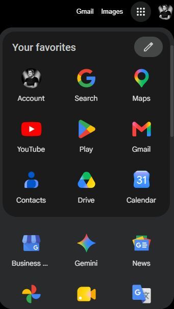
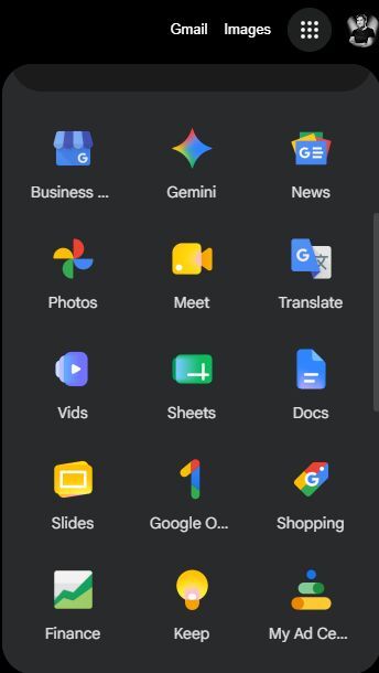
We kind of saw that change coming. The redesigned Google app icons were first spotted in a leak late last month and reported by 9to5Google. The leaked images showed a completely different look for the apps we’ve been so used to through the years and were met with mixed feelings.Now it seems that the design overhaul is starting to roll out officially, as Android Authority reported the new look popping up in the grid app menu in the Chrome browser.
What’s changed?
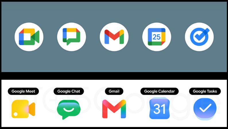
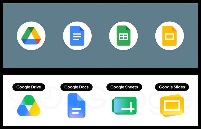
The redesign is quite dramatic, actually. As mentioned earlier, there’s apparently no requirement to use the four colors in the app icons, though some of the new ones still got them. Gmail is one example, but most of the others have dropped a color or two.
The shape and overall design have also changed substantially. The new icons are much more rounded and use gradients rather than clear borders between the colors. The look is also much more stylized, some might say modern.
Why is Google changing the look of its Workspace app icons?
This change is part of a big transition to Google’s Material 3 “Expressive” Design Language, and it also fixes a big issue.The boxy look of the previous icons (Google called it “perfect minimalism” back in 2020 when it first launched), along with the mandatory requirement for the use of all four Google colors, made some of the apps indistinguishable from one another, especially on busy phone screens.
Google is also trying to organize its whole ecosystem around AI (AI-first aesthetics), and the new icons’ design stems from Gemini.
The new redesign has been polarizing
When the first leaked images popped up back in April, the reception was mixed. Some people loved the new, modern look, while others found it cheap and disorienting.
I personally love the change, even though as a veteran Android user I’m quite accustomed to the way these icons look.
It will take some adjustment time, but in the end I think the change is a positive one. The rollout is far from over; some of the apps rock the old look, while others use the new gradient design, creating kind of a mess at the moment.What do you think about the new icons? Do you like them or do you prefer the old “minimalistic” look?