

Google cites AI for the reason it made changes to its app icons
A couple of months ago, back in September, Google explained the reason for this change by stating, “While staying true to Google’s iconic four colors, the brighter hues and gradient design symbolize the surge of AI-driven innovation and creative energy across our products and technology.” Google has decided to use the gradient look to represent “all of Google.” The Alphabet subsidiary will “continue this update across more products, platforms and services over the coming months.”
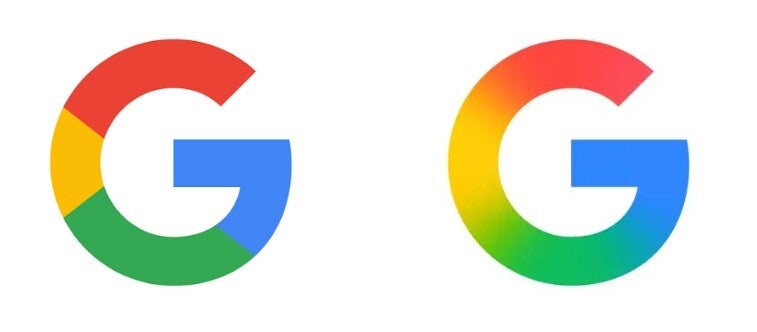
During the spring, Google announced its change to the icon for the Google app. | Image credit-9to5Google
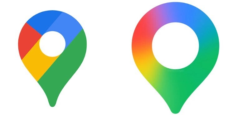
The old Google Maps icon on the left, and the new one coming soon. | Image credit-9to5Google
The Google Photos icon keeps four distinct sections, one for each color. The difference is that each of the four blades making up the pinwheel now uses a gradient design from the inside of each blade to the outside. The new icon is also larger.
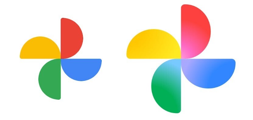
On the left, the old Google Photos icon with the updated con on the right. | Image credit-9to5Google
These Google apps could be next
Other icons that could soon get changed include the Play Store, Chrome, and the Calendar apps. Those three still have the four colors (red, yellow, green, blue) divided into four sections, each filled with one solid color. If you ask me, the gradient look appears to be a nice improvement and all of Google’s apps will sport better looking icons once this process is completely finished.