


Samsung makes some of the best smartphones in the world. And the soon-to-come
.
The problem with the Now Bar
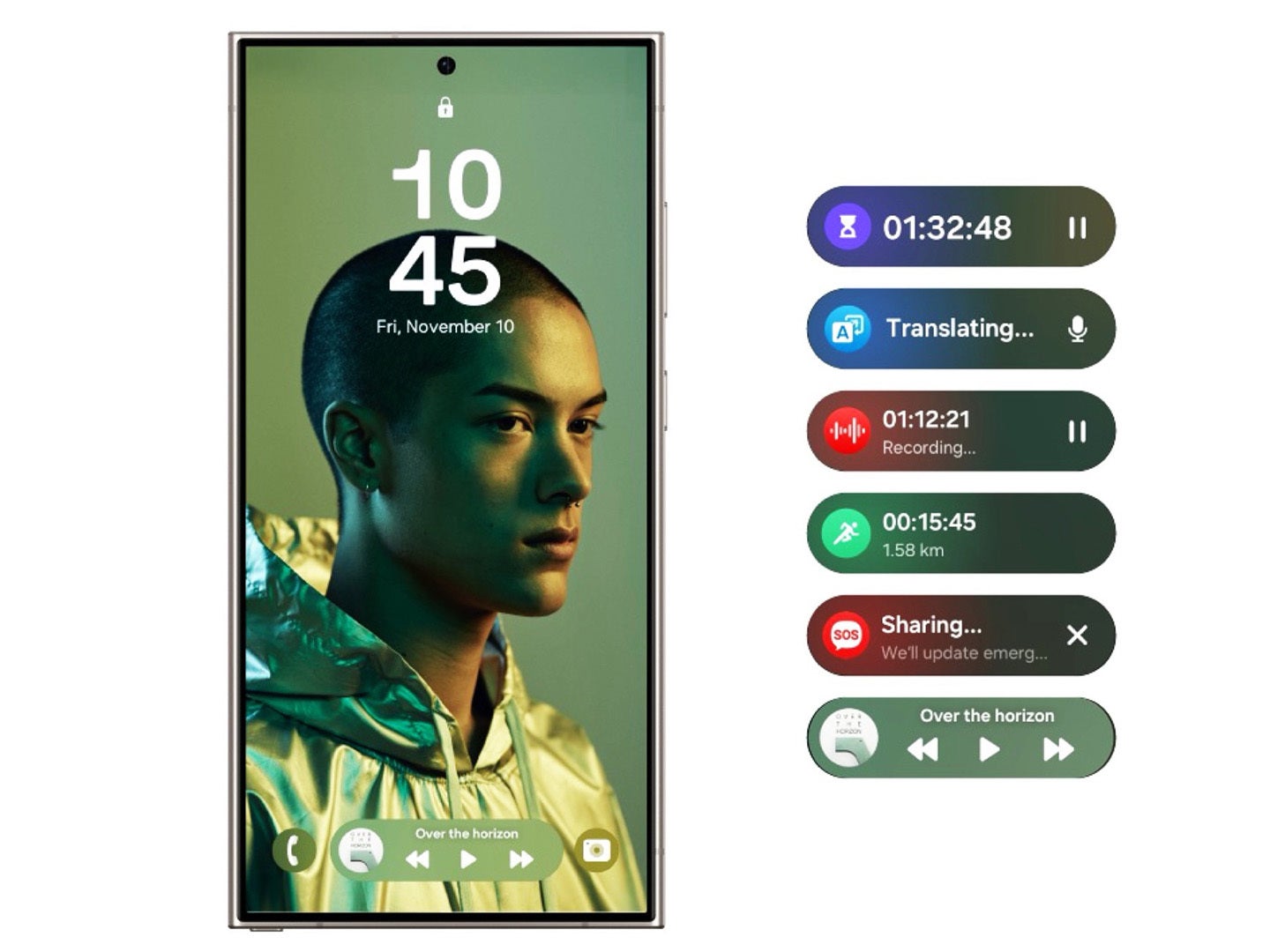
On paper, the Now Bar sounds like a good idea. It promises to be a one-stop shop for so many things, from media controls, to timers, to quick navigation info, to various contextual stuff. And of course, Samsung advertizes it as infused with AI!
In practice? It’s a mess.
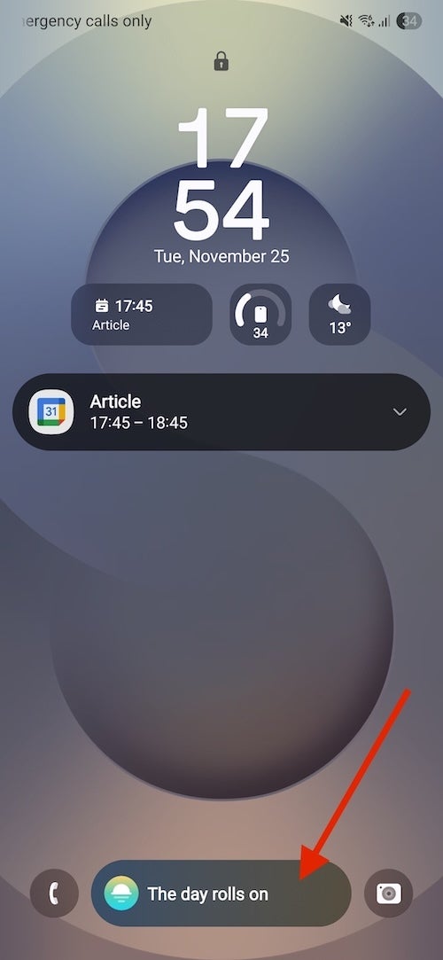
It replaces the previously large and easy-to-read media player widget that was right in the middle of the lock screen. That old player was accessible and legible, while the Now Bar is a tiny pill that you have to tap to expand, so that it’s usable. Why?
It gets in the way more than it helps
Also, the Now Bar is often completely useless. It offers suggestions you never asked for. Most of the time, it displays a completely meaningless message like “The day rolls on” or “Wishing you well”. Seriously? Who needs to see that?!
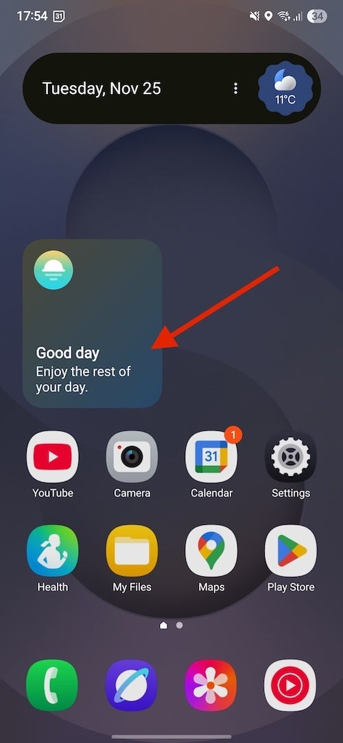
This looks like a placeholder for something useful that should eventually arrive, but that never happens.
Samsung wanted the Now Bar to be this clever, reactive piece of digital intelligence, but for me, it has mostly felt like a popup that I want to close.
It’s not the concept — it’s the execution
Look, I am not against smart, AI-powered experiences on my phone. If some company can figure it all out, I think users can get a lot of value from that.
But where exactly is the “AI” here? It doesn’t seem to learn habits in any way, often showing the exact same layout and generic greeting every day.
And here is just a small excerpt of the Samsung communities forums about this:
- “How do I fix/disable now bar?” — “To save the rant, the now bar is too small to comfortably use for me and I want the old version of the lock screen media player and maps, where it was a large easy to read, center of the screen notification sized”
- “How do i remove the now bar from the lock screen?” —
- “New update is AWFUL. How to get rid of the Now bar…” — “Instead of having my media (Spotify) at the top of the notifications area, it is much smaller on the bottom with less options. Only certain widgets can be put on the lock screen with notifications and it is not one of them. They added another row of apps once again making things smaller and more compact. Does anyone at least know a way to get rid of the now bar?”
Sure, the Now Bar can be useful once in a blue moon with some flight info or a sports score, but is it worth breaking or downgrading much more commonly used features for that? I don’t think so.