


Yes, I know what it does, yes I’ve reviewed a couple of iPhone models since then. But nothing like taking it on as my only carry and using it as my main phone.
Over this past month, I’ve put my SIM card into the ol’ iPhone 16 Pro Max, tempted by that Liquit Glass software and that last-of-a-kind titanium body. And I’ve discovered that… I kind of hate the Dynamic Island.
The widget operation is backwards
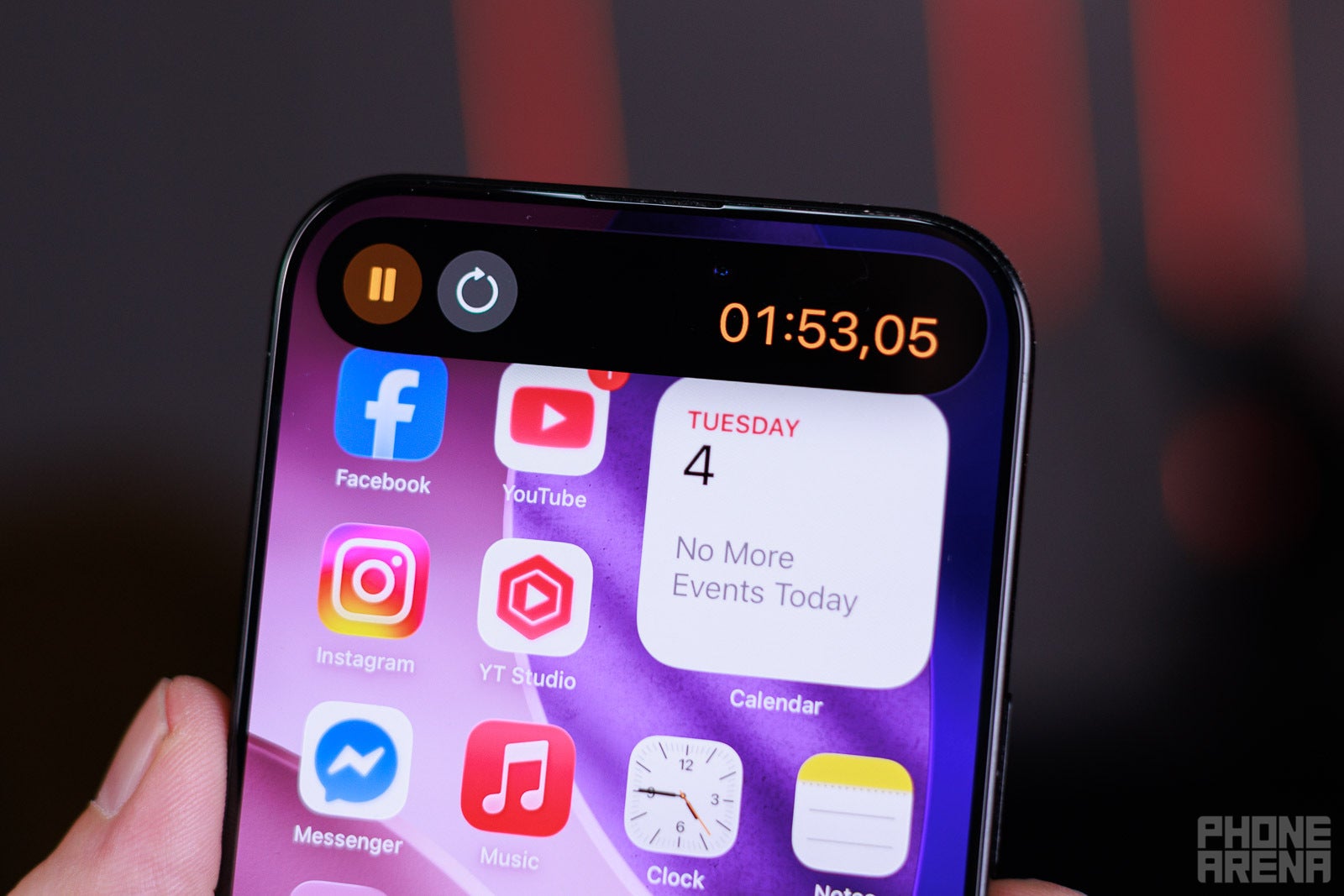
Tap and hold to get ‘quick access’ controls (Image Credit – PhoneArena)
OK, on the surface, the Dynamic Island is a pretty nice idea. It adds some form of multitasking to the iPhone, which has none. You can have various “active” widgets up there, appearing as tiny icons next to the selfie camera and Face ID sensors.
So, when you have music playing, the Dynamic Island shows a little audio wave, and you can tap and hold on it to get a bigger widget for multimedia controls. If you tap it once, the iPhone immediately drops what you are doing and swaps to the fullscreen music app that is active.
Wait, what?
The entire point of the Dynamic Island is to make things quick and easy, I thought. In my mind, the floating widget should appear with just a single tap. A tap and hold — the slower gesture — should be the action that takes you to the big app. Not the other way around. Why am I given quick access to controls, but only if I hold my finger on the screen?
I am playing “don’t whack the Dynamic Island” with my thumb
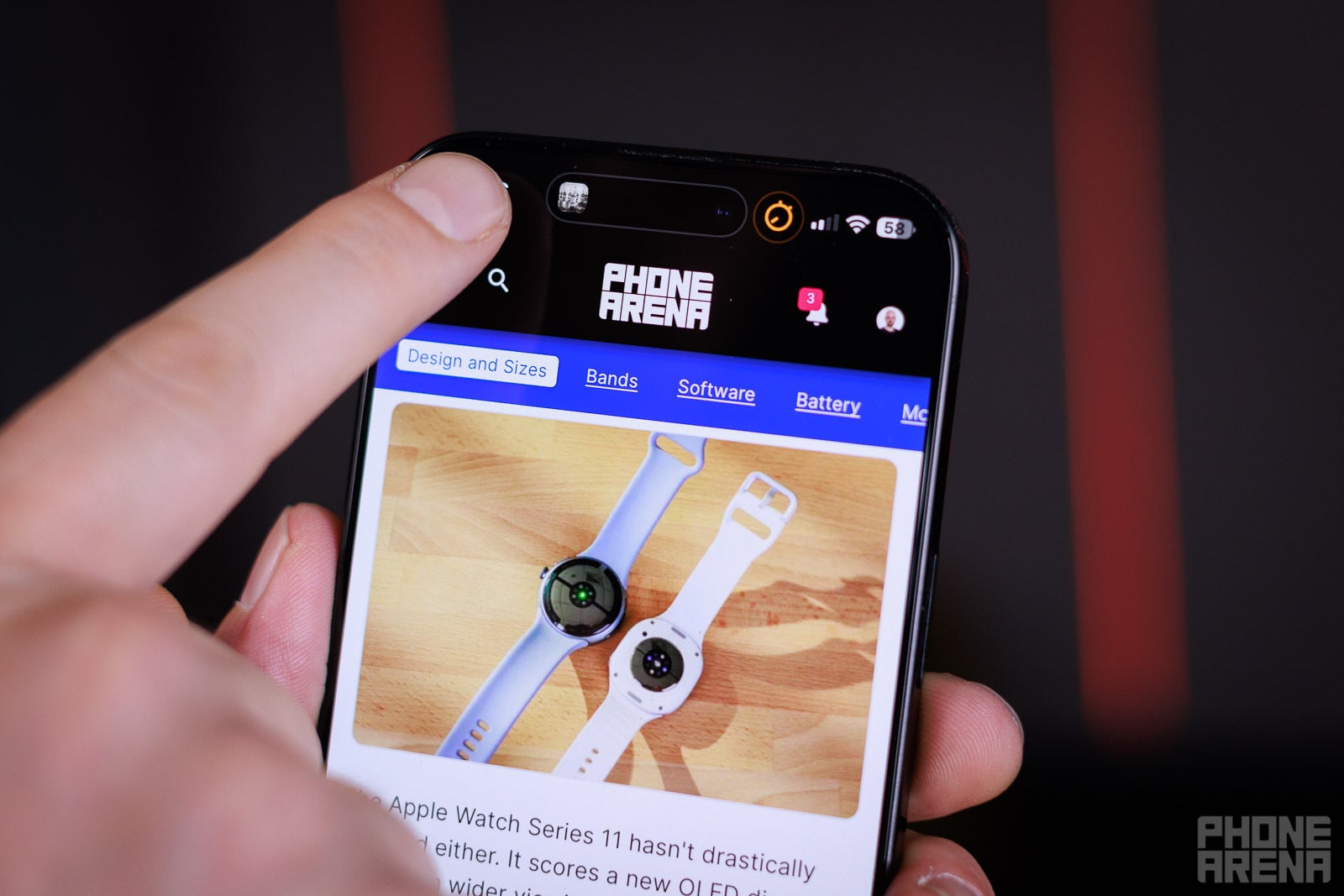
iOS has a lovely feature — whenever viewing a long website or document, you can tap at the very top of the screen for an instant “return to top” function. I’ve used this for years and it’s pretty convenient, to the point it’s second nature.Well, not so much now. If I have an active widget going on on the Dynamic island, I do have to take care to not tap it. Because not only will I not return to top, I will swap to a whole different app, due to the functionality described above.
I don’t like smudging up my selfie camera
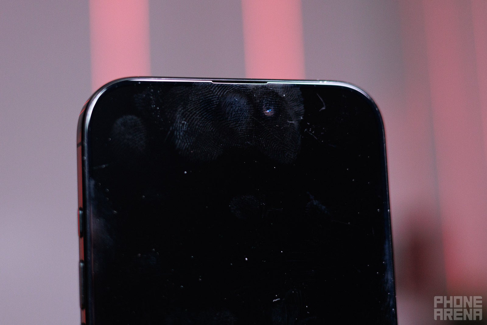
I think we can all agree that it’s pretty silly to have an interface element on the one place of the screen you don’t want to be touching. Yes, you can wipe it away easily, but that doesn’t mean I enjoy constantly having fingerprints on my selfie camera lens.Technically, the Dynamic Island is a bit wider than the whole Face ID cutout, so you can tap at its corners. Or go super-precise and tap between the selfie camera and the IR blaster. But let’s be real, sometimes — or often enough — that finger will land exactly on the selfie camera lens. Awesome…
Samsung copied it right
Samsung introduced the Now Bar with One UI 7 this year, and it is a pretty obvious riff on the Dynamic Island. But here’s how it’s better:
On the lock screen or always-on-display, the Now Bar actually moves to the bottom of the display. This makes it easier to thumb-tap or swipe it when you are just taking your phone out of your pocket and just holing it with one hand for at-a-glance information.
When the screen is unlocked, the Now Bar sits in the top left corner of the screen, not over the actual selfie camera.
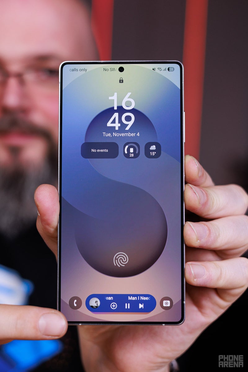
Simply tapping the Now Bar once expands the active widget behind it, so you can get to it faster and easier. Then, tapping on that widget again will actually open the entire app — it’s much more deliberate and logical.
Is there hope that Apple would redo it?
Apple does hate changing around user experience elements. It doesn’t want to create any friction when it comes to new OS experience, which is why we still have old and silly features like “shake the phone for Undo”, even though you can now do it by triple-finger tapping on the screen instead.So, my hopes for the way the Dynamic Island operates to be shuffled around… are very, very low. It is what it is, and definitely not an experience-breaking thing. It just baffles me that it was designed this way in the first place. Otherwise, the idea behind it — to add some quick-tap multitasking to the iPhone — was sorely needed and is much appreciated.